✸ PROJECT Kidunified
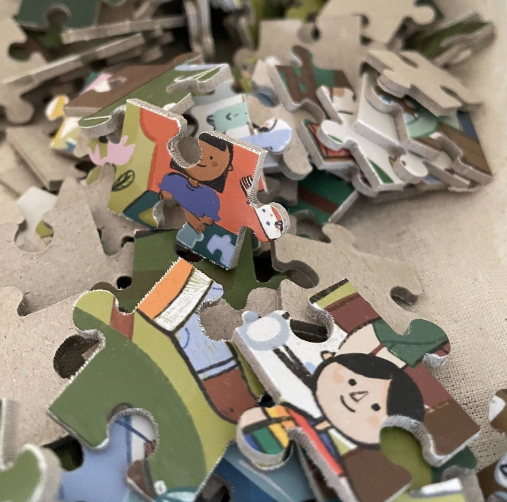
Kidunified™ is a Canadian, Women-led, Puzzle Company based in Guelph Ontario. Their puzzles focus on diversity, sustainability, and bilingual fun! Their goal is for more children to see pieces of themselves and their community while they play. I was thrilled to design their puzzle, create their brand identity & packaging, and bring Kidunified’s dream to life.


When designing the branding for Kidunified, I wanted to keep it fun, accessible, and approachable. The smile icon to me is playful and youthful. But it also reminds me of two kids playing and joining together.The colours I chose are jewel-toned, or muted/soft versions of primary colours in the hopes to have a well-rounded but calming arrangement. I wanted to avoid overly bright colours so as to not be overstimulating, but still with enough contrast for individuals with vision impairment.✸
Big Dreams
✿
Small Clients
✿
Big Dreams ✿ Small Clients ✿
SCOPE
brand identitypackaging puzzle illustration social media assets marketing material


